
Resources
Logo, Colour & Typography
Section 01
Logo Identity
Marcus Vitruvius Pollio, commonly known as Vitruvius or Vitruvi, was a Roman military engineer and officer in the 1st century BC. He is considered to be the first architect and advanced the importance of a triad: things must have beauty and grace, they must have function and utility, and they must have quality and strength.
Primary Logo Design
The primary logo is the most widely used version of the logo. It is used to identify the brand, establish recognition, and create associations with your business.

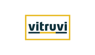
Logo Variations
The logo should preferably be in color. The one-color version may be used in justified cases, e.g., and it is not possible to use the color version for technical reasons (embossing, engraving, etc.).
Logo shown in 1 colour on the dark background
Logo shown in greyscale
Logo shown in reverse
Logo shown in black
Clear Space & Minimum Size

Incorrect Usage
decorative shapes should not appear as part
of the logo. These items may be used, but
not within the logo’s ‘surrounding space’.
logo, no matter which version, should not be
implemented as it confuses the audience.

should not be used as it dilutes the identity.
Pantone colour should not be used.

the logo should not be used as it detracts
from its impact.
Section 02
Colour
It is important to maintain the integrity of the colour scheme set out in this guideline. Below are the primary brand colours – with correct alternative values. The primary palette should be applied in all digital communications.
Primary Colour Palette
Vitruvi Aegean Blue
CMYK : 45, 14, 0, 76
Pantone : 4161C
RGB : 51, 75, 92
Vitruvi Light Blue
CMYK : 53, 21, 12, 3
Pantone : 2206C
RGB : 124, 160, 182
Vitruvi Yellow - Logo
CMYK : 2, 25, 96, 0
Pantone : 7408C
RGB : 232, 188, 40
Secondary Colour Palette
Vitruvi Teal - Logo
CMYK : 100, 66, 55, 56
Pantone : 547C
RGB : 17, 51, 61
Vitruvi Slate Blue
CMYK : 69, 37, 19, 16
Pantone : 5405C
RGB : 81, 121, 146
Vitruvi Silver Blue
CMYK : 5, 2, 0, 5
Pantone : 656C
RGB : 232, 237, 243
Vitruvi Grey
CMYK : 63, 51, 49, 35
Pantone : 425C
RGB : 85, 88, 90
Section 03
Typography
A standardized font system has been established for all brand communications.
Wherever possible, the primary typeface should be chosen for all digital communications. For instances where the primary typeface is not suitable for use, i.e. email templates etc, the alternative typefaces are a suitable option and should be available to all users as a standard system font. The typeface families can be utilized in their various weights. Please refer to the following section for styling.
Heebo Black
a b c d e f g h i j k l m n o p r s t u w x y z
a b c d e f g h i j k l m n o p r s t u w x y z
0 1 2 3 4 5 6 7 8 9 ! @ # $ % & *
Use me in headlines and
titles to grab attention.
Heebo Light
a b c d e f g h i j k l m n o p r s t u w x y z
a b c d e f g h i j k l m n o p r s t u w x y z
0 1 2 3 4 5 6 7 8 9 ! @ # $ % & *
Use me in a heading of a subsection printed within the body of the text.
Heebo Black
a b c d e f g h i j k l m n o p r s t u w x y z
0 1 2 3 4 5 6 7 8 9 ! @ # $ % & *
Use me in crossheading or blockquote.Use me in a heading of a subsection printed within
the body of the text.
a b c d e f g h i j k l m n o p r s t u w x y z
a b c d e f g h i j k l m n o p r s t u w x y z
0 1 2 3 4 5 6 7 8 9 ! @ # $ % & *
Use me in subtitles
Use me in body copy for most of our content. This clean and utilitarian font is unpretentious and versatile.
Link to Fonts
Typography Examples
Icons & Photography
Section 04
Iconography
Skillful use of icons increases the graphic attractiveness of each project while adding character to them. Icons well suited to the layout are perfect as a binder, an intermediate form between graphics and texts placed on a website or application.


Features


Pricing


How it Works


Why Vitruvi


Values


Support &
Contact


Link to Icons
Section 05
Photography
Here you can find examples of photo treatments with PSD reference files. Click on a thumbnail of a photo to download its PSD. For any questions on photography style or use, please consult your approved brand manager.

Photo Type 01
yellow elements of work clothing and equipment,
natural colors of human skin and hair

Photo Type 02
natural colors of human skin and hair

Photo Type 03

Photo Type 04
Link to Photography


